I. Enhancing Learning Experiences: 6 Best Practices for Effective Learning Design
It only takes a learner three to five seconds to judge the value of an eLearning screen. - shiftelearning.com
First impressions are important. Your opening slide needs to be intriguing, and offer value to the learner.
Content developers often create educational resources that are pedagogically sound, but lack thoughtful learning design.
E-learning materials not only need aesthetic appeal to catch learners' attention, but must also be intuitively and pedagogically organized to keep learners engaged. Bad learning design can undermine your whole lesson, course, or entire learning operations.
Luckily, our experienced content creation team has compiled a list of 5 Best Learning Design Practices. This will enable you to avoid some major pitfalls, saving your team time and resources and helping you deliver awesome e-learning experiences.
Use Consistent Visual Branding

Happy Potter’s invitation letter to Hogwarts was handwritten, contained the school’s logo, and was signed, stamped and sealed. It couldn’t have been mistaken for another wizarding school.
Your learners have entrusted your company to help them achieve their goals. This means all of your e-learning materials need to appear original and authentic. You can do that with consistent branding.
Feature your company logo at every reasonable opportunity, and agree upon your slidedeck’s color palette, typography, and graphical elements beforehand.
Creating a unified look and feel to your designs boosts lesson credibility and makes your learners feel at ease.

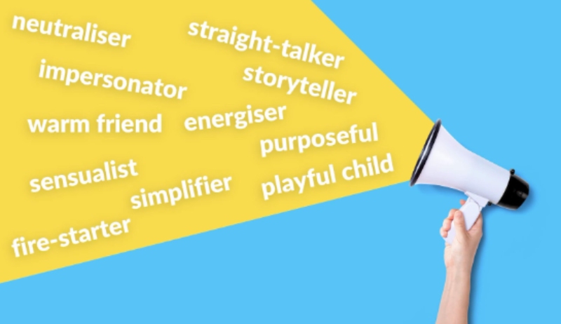
Develop a Consistent Voice
Words trigger emotions. Teachers can subtly adapt their tone based on their learners and content. However, when the teacher is not speaking, the text on the slides should speak for you. Content creators need to get the tone right, and be consistent.

When authoring learning objectives, instructions, or reading passages, your tone depends on whether you’ve chosen a formal or informal approach. However, it can depend on which spelling, grammar, and usage rules you’ve agreed upon.
There’s nothing worse than a content creation team spending half the day figuring out whether to use the Oxford comma. They also capitalize the "a" after the colon, or call it football or soccer.
When there are multiple writers on a team create a writing / linguistic style guide that sets the standard writing, grammar, and punctuation conventions to avoid disjointed writing and most importantly confusing your learners.
Create Interaction at Every Opportunity
Victorian Era school children using chalk to write on slates and wiping them clean with a wet rag was probably more interactive than 21st century students staring at a 1 dimensional PowerPoint.

The bottom line is, if your materials aren’t interactive and gamified, they dampen the learner experience and keep your institution from maximizing its potential.
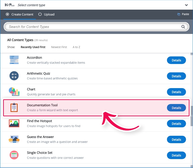
One way to ensure your content incorporates interactivity throughout a lesson is by using the H5P content authoring tool.

With H5P, learning designers can seamlessly embed interactive elements within their content, turning passive learning experiences into dynamic and immersive journeys. H5P supports a wide range of interactive formats, including quizzes, presentations, games, interactive videos, and timelines. Allowing your learners to explore your content in a non-linear way creates a sense of exploration, rather than just instruction.

Avoid Content Overload
My friends all tell me that when I get excited about a certain topic I talk fast. When I talk fast, I mumble and become incoherent. The same thing happens when content creators try to put too much on one slide, or give too much info all at the same time.
Effective learning design dictates content layering into digestible chunks. Like a magician unveiling a bunny, new learning points should be revealed when learners understand previous ideas. Learning designers can conceal information behind buttons, images, or drag drops. Knowing how to use all the interactive elements available allows the teacher to set the pace of the class. This allows learners to explore and discover information at their own pace.

Find out more about Best microlearning practices.
Accessible Content across Devices

Even experienced companies that offer interactive learning experiences struggle to ensure their experiences work on every device. Making your content accessible and streamlined across hardware, operating systems and internet browsers can be a daunting task.
Lack of learner accessibility is a one-way street to poor user experience.
Make sure your designers have experience with the content authoring tool your company uses. Test your slides for compatibility on all devices before delivering content.
Have Complete Control Over your Content
Educational institutions should be cautious about agreeing to license curriculums from major developers as such agreements may restrict any editing of the content.
Having complete authoring control of the content helps to avoid students being exposed to materials inappropriate for their age, culture, religious beliefs, or certain ideologies.
Curriculums should reflect the learners' cultural context and values. Having total control over the content allows creators to incorporate local history, literature, and societal perspectives. This ensures that education aligns with learners' cultural identity.

Enhance the Learning Experience
Poorly designed content affects engagement. When learners are not engaged with the material, little or no learning occurs.
By working with a professional content provider, educational institutions can produce content, courses and curriculums that implement best practices for effective learning design.

Whether your company wants your old slide decks turned into interactive lessons, rethink of your visual design, or a completely bespoke curriculum, our team of professional instructional, learning and graphic designers here at OOOLAB can help you level up your content.
Don’t let bad content keep your brand from thriving and your student’s from flying.
Contact us today for a free consultation.


